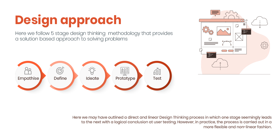
Approach
One of the key reasons for the success of Babe is my adoption of the five-stage design thinking methodology. This approach enables me to provide a solution-based approach to solving the problem of pet care. I understand that the needs of pet owners are complex and varied, and I have found that following this iterative process helps me to derive the best possible solution. Through each stage of the process, I am able to gain a deeper understanding of my users, define the problem at hand, ideate and prototype solutions, and test and iterate until I arrive at a final solution that truly meets the needs of pet owners.
Step 1
Research (Empathise)
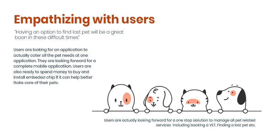
Firstly, I spent time observing pet owners in their natural environment - at home or in their courtyards with their pets. By doing so, I was able to observe how they interacted with their pets and the products they used, such as pet food, toys, and grooming tools. This gave me a better understanding of their behaviours and needs and helped me identify pain points in their daily routines.
In addition to observations, I engaged with pet owners in interviews to gain further insights. During these interviews, I asked questions about their experiences with pet care and any challenges they faced. This allowed me to gain a deeper understanding of their motivations, emotions, and decision-making processes.
Furthermore, I conducted surveys and online research to gather information about pet care trends and common issues faced by pet owners. This helped me identify gaps in the market and opportunities to create innovative solutions that would improve the pet care experience for pet owners.
Through these research activities, I gained valuable insights that helped me identify the key problems that pet owners face, including the challenge of tracking and responding to their pet's status round the clock. This led me to develop the Babe pet care application, which enables pet owners to track and respond to their pet's status in real-time, based on the data sent by the chip that is deeply embedded under the skin of pets.
Overall, the empathize stage of the design thinking process was critical in helping me gain a deep understanding of pet owners' needs and pain points, which in turn allowed me to develop a solution that truly meets their needs and improves their overall pet care experience.
Step 2
Define (Analyse)
Step 2
Define (Analyse)
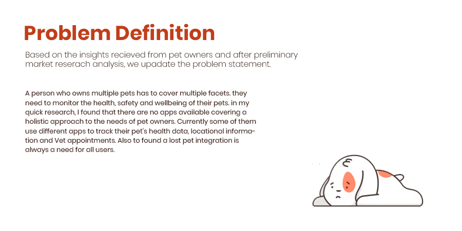
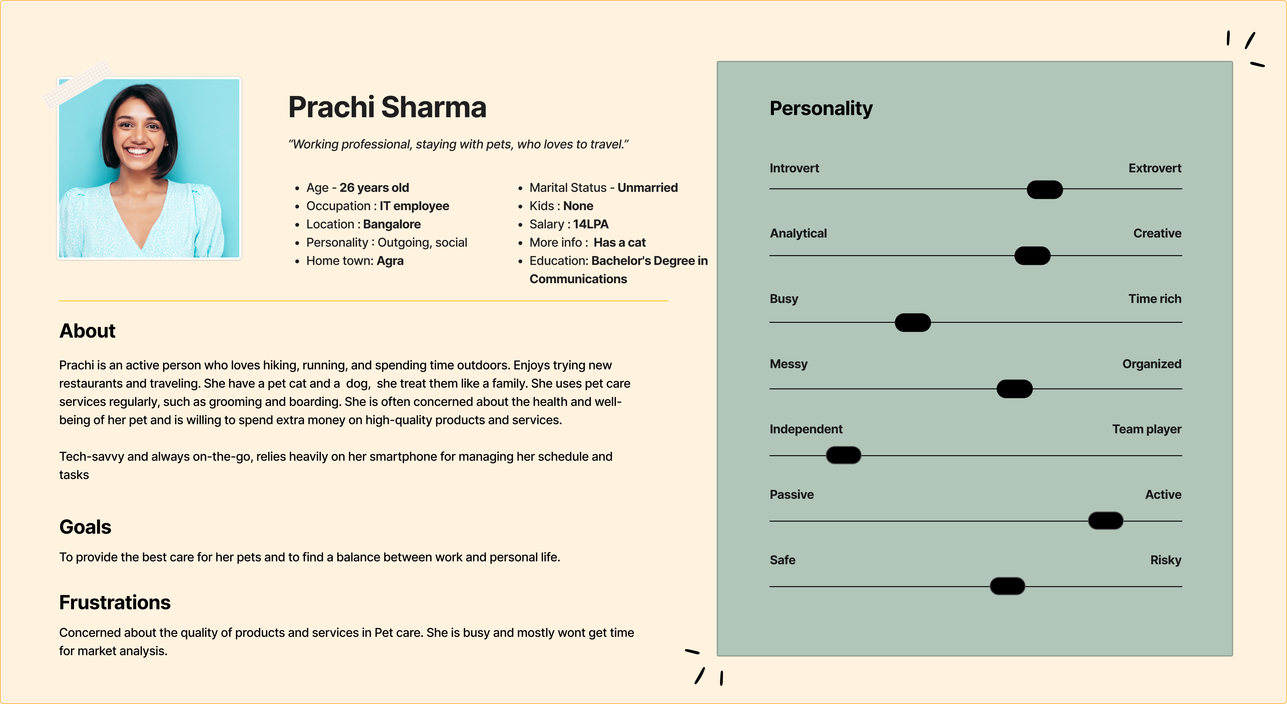
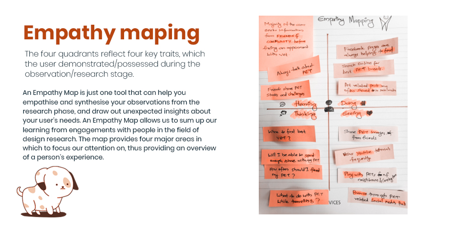
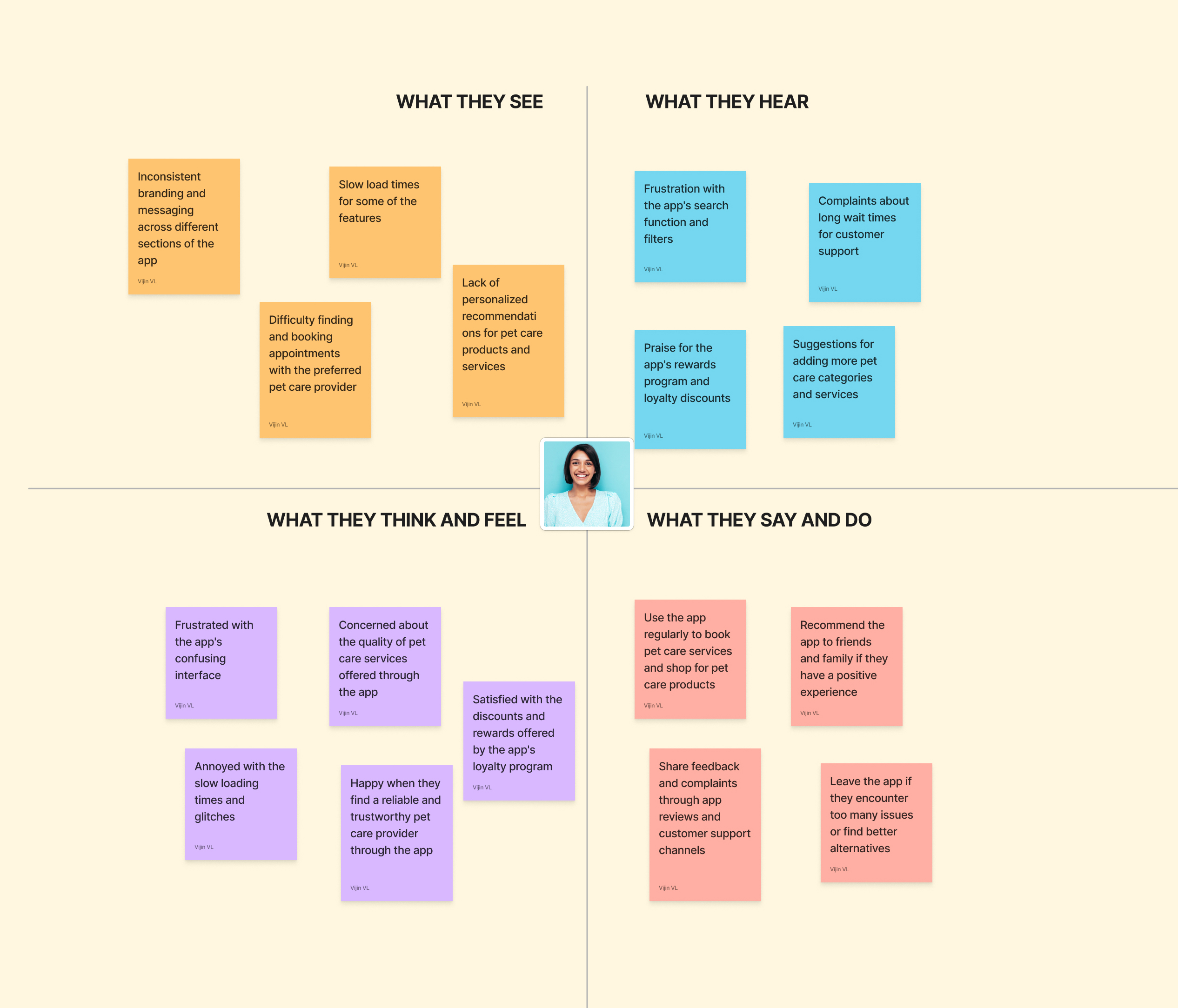
An Empathy map will help us understand our user’s needs while we develop a deeper understanding of the persons we are designing for. There are many techniques we use to develop this kind of empathy. An Empathy Map is just one tool that can help us empathise and synthesise our observations from the research phase, and draw out unexpected insights about our user’s needs. An Empathy Map allows us to sum up our learning from engagements with people in the field of design research. The map provides four major areas in which to focus our attention on, thus providing an overview of a person’s experience. Empathy maps are also great as a background for the construction of the personas that we would often want to create later.
An Empathy Map consists of four quadrants. The four quadrants reflect four key traits, which the user demonstrated/possessed during the observation/research stage. The four quadrants refer to what the user: Said, Did, Thought, and Felt. It’s fairly easy to determine what the user said and did. However, determining what they thought and felt should be based on careful observations and analysis as to how they behaved and responded to certain activities, suggestions, conversations, etc.
Step 3
Ideate
Step 3
Ideate
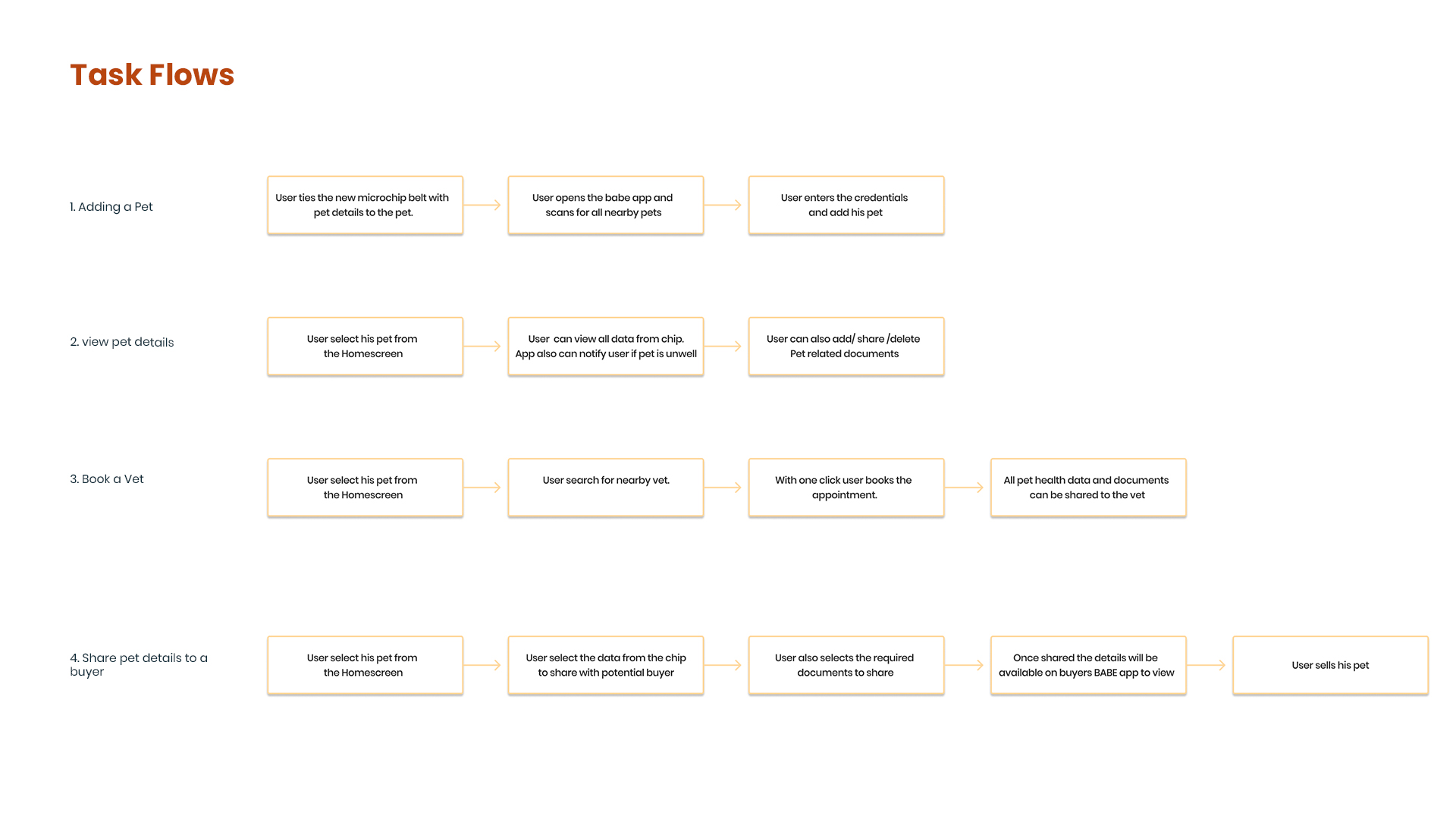
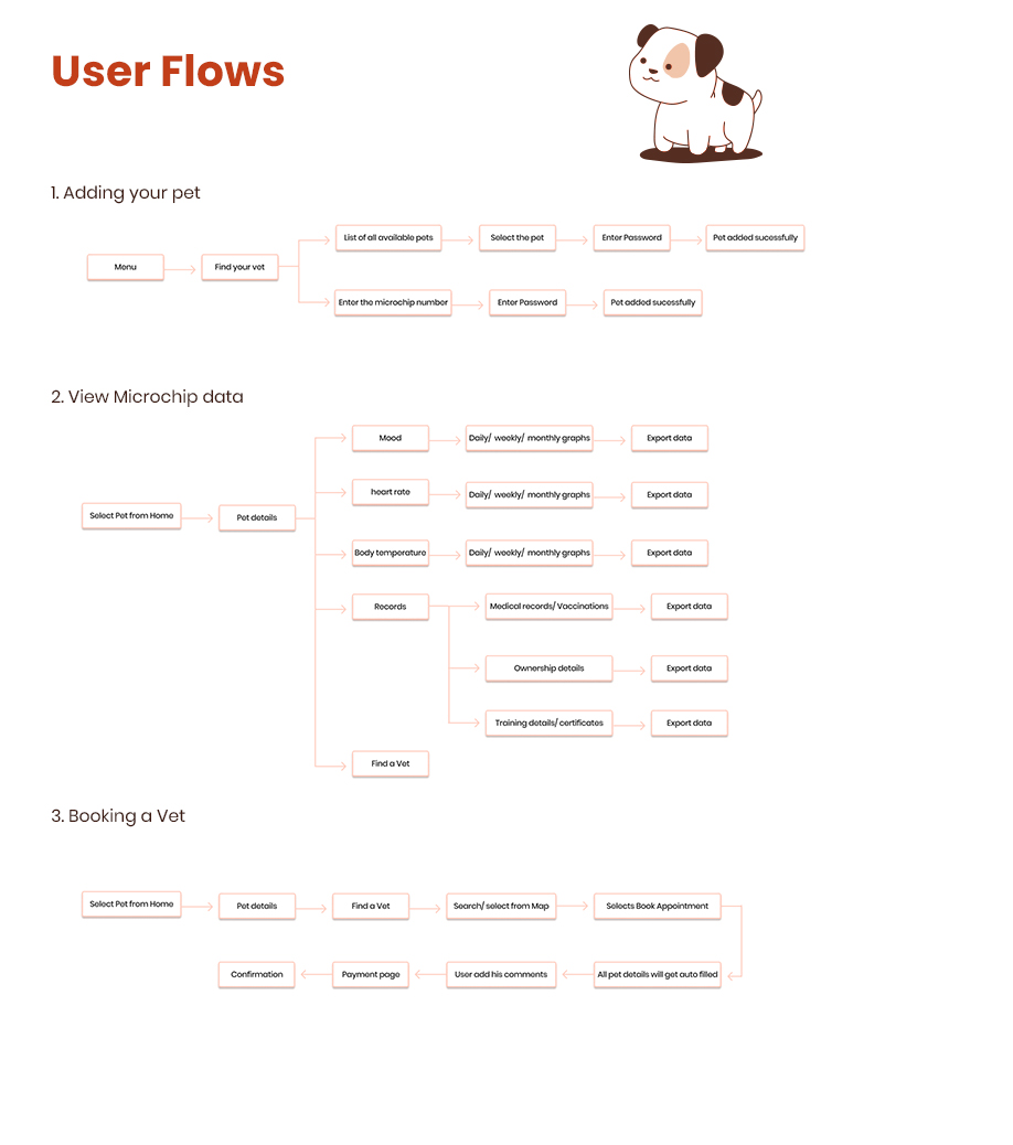
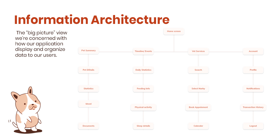
In general terms the way we design information architecture (IA) for the mobile environment is very similar to the way that you design the IA for the desktop. The approach we use is near identical in fact but there are some important
things to bear in mind when we do so:
Deliver what’s important on the mobile platform – that means we should focus on what’s important to the user when they’re using a smartphone. That doesn’t mean that our users will necessarily be using our app when
they’re on the move or on the street – we need to research the way that they will use the app. That, in turn, lets us focus on the content that’s of value to the user and cut down the volume of data that we present on mobile.
In our case clients will be using this application during day time mostly at home or office
Content should be focused on mobile – that’s smaller, simpler and easier to handle content than on the desktop. The limit of screen real estate makes large volumes of content more confusing on mobile than on a
larger monitor.
Navigation should be simple – that means limiting the number of menu options and keeping things focused on what’s important to the user.
Step 3
Ideate
Step 3
Ideate
Step 4
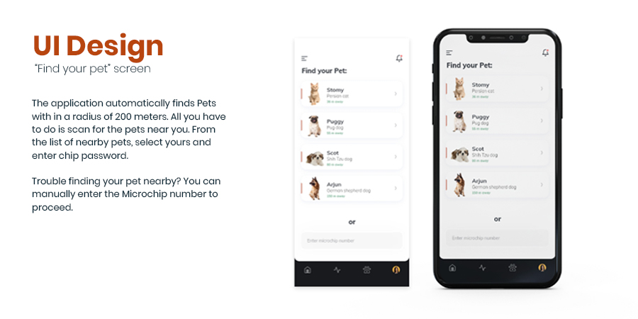
UI Design
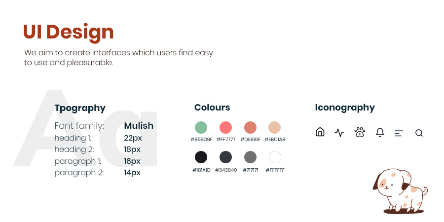
Mock Up
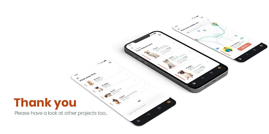
After incorporating all the feedback, we created the final visual design mock-ups, which are shown below. These mock-ups are a representation of the final product design and demonstrate how users will interact with the Babe pet care application. The final visual design mock-ups were carefully created to ensure that the user experience is intuitive, engaging, and meets the needs of pet owners. By creating these mock-ups, we were able to bring our ideas to life and create a clear vision for the final product
Project Name
Babe - Pet care mobile application
Software
Adobe XD, Adobe Illustrator CC, Adobe Photoshop CC


